
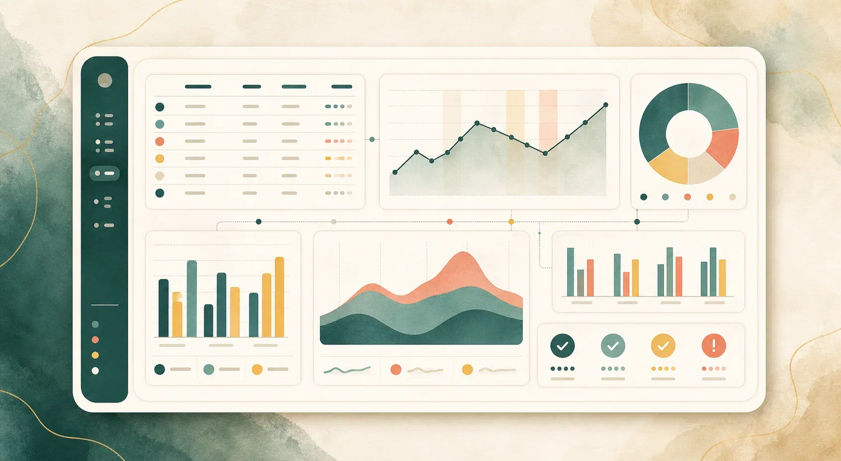

An isolated number says very little. It gains meaning when it meets a question, a context, and someone willing to look beyond the surface.
In imaging services, productivity, demand, time, and quality data can form a useful reading of operations. The challenge is twofold: keeping that reading from getting lost in screens full of metrics, and keeping it from presenting numbers the available data does not support.
The data already exists, but not as an answer
How many minutes did the patient wait between arriving and entering the room? Which scanner sat idle on Tuesday afternoon? How many exams had to be repeated last month?
In most services, answering any of these questions requires someone to stop what they are doing and count by hand. It is not a lack of data. The PACS — the system that stores and distributes exam images — records all of it with every study performed. It simply was not built to organize that record as an answer.
Alongside each exam, the DICOM standard stores a set of text fields: the study date and time, the equipment that produced it, the body part examined, the exam description, the referring physician, the time of each acquisition series. These fields are the metadata, and time and volume indicators come from them — not from the images.
Reading them requires nothing outside the standard. C-FIND, the classic DICOM query, and QIDO-RS, its DICOMweb equivalent, exist to ask the server which studies are there and which fields they carry. They are queries: what travels is each exam’s line of metadata.
The data is already produced by the routine
None of this requires new data collection. Every exam records its own metadata at the moment it is performed, with no form for anyone to fill in and no extra step for the team. The record behind the indicators is the same one the service already produces in order to operate.
The upfront cost is usually standardization, not collection. When the same procedure is registered under dozens of spellings — the same spine MRI abbreviated one way at the front desk and another at the scanner, sometimes with the contrast note, sometimes without — the count by exam type fragments a volume that is in practice concentrated. The same goes for the name each workstation uses to identify itself on the network. The fix belongs at the source: the scheduling system, the equipment protocol, the workstation configuration.
That correction is made once. After it, the data arrives organized with no recurring effort, and every exam performed enters the indicators the same day.
What those same fields begin to answer
Reading metadata has an operational purpose: understanding times, workflow, and use of the facility. But once standardized, those same fields support management questions that used to require a separate survey.
- Realized and projected revenue. With the exam price registered by modality or by type, volume becomes estimated revenue by period, unit, and modality, and the historical series allows projecting the next period.
- Capacity that is already paid for. Gaps between exams, quieter shifts, and low-volume days show where there is room to serve more without buying equipment or expanding the facility.
- Dependence on a single modality. When one modality concentrates most of the revenue, a technical stoppage of the corresponding scanner stops being a maintenance problem and becomes a financial risk. The size of that concentration is measurable.
- Patient retention. Recognizing that two exams belong to the same person allows measuring returns and the interval between visits without needing to know who that person is.
- Signs of repetition. Exams of the same region within a short window deserve checking. They may be complementary studies ordered together, but they may also be repeats after a technical failure — which occupies the room, delays the report, and weighs on the experience of whoever waited.
These are all estimates, and they depend on what was registered. Calculated revenue is worth exactly what the entered prices are worth, and what share of exams has a price assigned. Both deserve to be stated next to the total.
Begin with the question
Before choosing an indicator, ask what the team needs to understand. Is the workflow balanced? When does demand change? Where do avoidable waits arise?
Concrete questions turn data into possible decisions.
A good visualization does not try to show everything. It organizes the conversation:
- highlights changes that deserve attention;
- makes periods easy to compare;
- connects the indicator to the routine that produced it;
- invites investigation instead of anticipating conclusions.
When the dashboard says it cannot measure
Not every service records everything, and that difference changes what can be calculated.
Waiting time is the most common example. It depends on MPPS, the record the equipment emits when the procedure actually begins. Many services do not have that integration active. Without MPPS there is no start time, and an average wait calculated over a small fraction of exams describes that fraction, not the operation.
That is why it helps to measure each field’s coverage within the filtered range before displaying the indicator. Below a coverage floor, the indicator leaves the dashboard and its place explains which field is missing. Between that floor and full coverage, it appears marked as partial, with the fraction stated. Whoever reads it knows how many exams the number was calculated over.
There is a middle ground that also needs to stay visible. When the start time is missing but the time of the first image exists, the wait can be estimated from it. The estimate is usable and belongs in the averages — as long as it is labeled as an estimate rather than blended into direct measurements.
A missing field biases more than its own indicator. If the referring physician is identified in only a minority of exams, the list of top referrers describes only those who were recorded, and the main referrers may well be the ones who do not appear.
An odd number usually points back to the data’s origin
A negative duration between the start and end of an exam is not a result; it is a symptom. And the cause changes the fix.
When it appears sporadically, it usually means the equipment clock and the PACS clock are out of sync — a configuration problem with NTP, the service that keeps clocks aligned.
When it appears systematically, across nearly every exam from the same scanner, the explanation is different: the PACS is recording the study time at closing or sending, not at patient registration. Synchronizing clocks changes nothing there. It is better to recognize that the difference measures something else — the interval between the first image and the study’s closing — and use it as such.
Tracking the proportion of valid, inconsistent, and estimated measurements over time helps in both cases. A jump in inconsistencies marks the day the problem began, which is usually more useful than the accumulated total.
Almost every indicator depends on a denominator
Much of the disagreement about a reading comes from a question nobody asked out loud: what was this number divided by?
A few examples that come up often:
- Days with data or calendar days. The daily exam average changes depending on whether the period was counted in full or only on the days with recorded activity.
- Actual hours or 24 hours. If idle time is calculated against the whole day, every service looks idle. Against the configured opening hours, day of the week by day of the week, it starts saying something about the operation.
- Observation window. A return rate measured over three months counts a patient who has one exam a year as new. The number is not wrong; it answers a smaller question than it appears to answer.
- Modality. CT produces several series per exam, which allows measuring the duration of each and the interval between them. Radiography produces a single series and does not. An average across the two describes a service that does not exist.
The average has a problem of its own. When waiting splits into two groups — some patients enter with almost no queue while others accumulate hours — the average falls in the middle and describes neither. The median and the 90th percentile separate those groups and show where the problem is.
Financial indicators depend on an effective date. When an exam’s price changes, history must remain calculated at the price in force on each date. Without that, March revenue shifts because the table changed in July.
Metrics describe processes, not people
No dashboard knows the whole story. An increase in average time may signal a problem, but it may also reflect a change in exam complexity or a conscious decision by the team.
This matters more when the indicator is individual. A technologist with long times may be handling pediatric patients, contrast-enhanced exams, or people with reduced mobility. The number describes the process of that appointment, not the competence of whoever conducted it.
Data provides clues. Context turns those clues into understanding.
The same applies to automated readings. When a report is generated by artificial intelligence from the indicators, it needs the same constraints: no inventing numbers or references, no clinical recommendations, and no commentary on an indicator that was hidden for lack of data. About those, the only useful statement is that they do not exist in that range, and why. When a threshold comes from market practice rather than a published standard, that deserves to be written down too.
Clarity for action
The goal is not to monitor more numbers. It is to notice sooner, have better conversations, and choose with greater confidence.
That depends less on the quantity of indicators than on three things: knowing where each number came from, what it was calculated over, and what it still cannot say.